
What is typography?
Typography is the creative technique of arranging type, selecting complimentary fonts, and optimizing legibility and readability to form a composition that is visually appealing to readers. Type is the basic building block of all graphic design work, and can make or break the success of a campaign, brand, or website.
Typographic Style
Typographic styling can be used to establish the tone, professionalism, and even influence your audience’s perception of your authority on a subject when chosen properly. For example, you might question the validity and professionalism of an online bank whose font choices are funky, fun fonts to prompt you to provide your social security number. On the other hand, you may expect a fun, bubbly font on a website for a brand selling children’s clothes.
So, we know that fonts affect the way readers receive a message. How much influence does a font choice have? Check out some of the examples below and determine for yourself:

Above is the same message in two very different fonts. The first establishes a tone of caring, love, and thoughtfulness, where the second one is abrasive, and unfriendly, and likely not something you would like to find in your mailbox. What causes such contrasting messages from the same exact words? There are a few visual elements at play here.
First, cultural understanding and precedent; you have likely received a thoughtful card from a caring friend or relative. And although I hope you have never received a ransom note made of magazine clippings, surely, you have seen one in a horror or thriller film.
Second, if you somehow miss the cultural understanding, the visual fluidity and lack of tension, paired with the uniquely human element of handwriting all help to convey a tone of gentleness. The second sample’s asymmetry, filled-in counter parts, and backwards glyphs create excessive visual tension which is subconsciously associated with danger and warning.
Below are a few more samples of how fonts can be used to influence a reader’s associations with certain events, eras, and experiences.


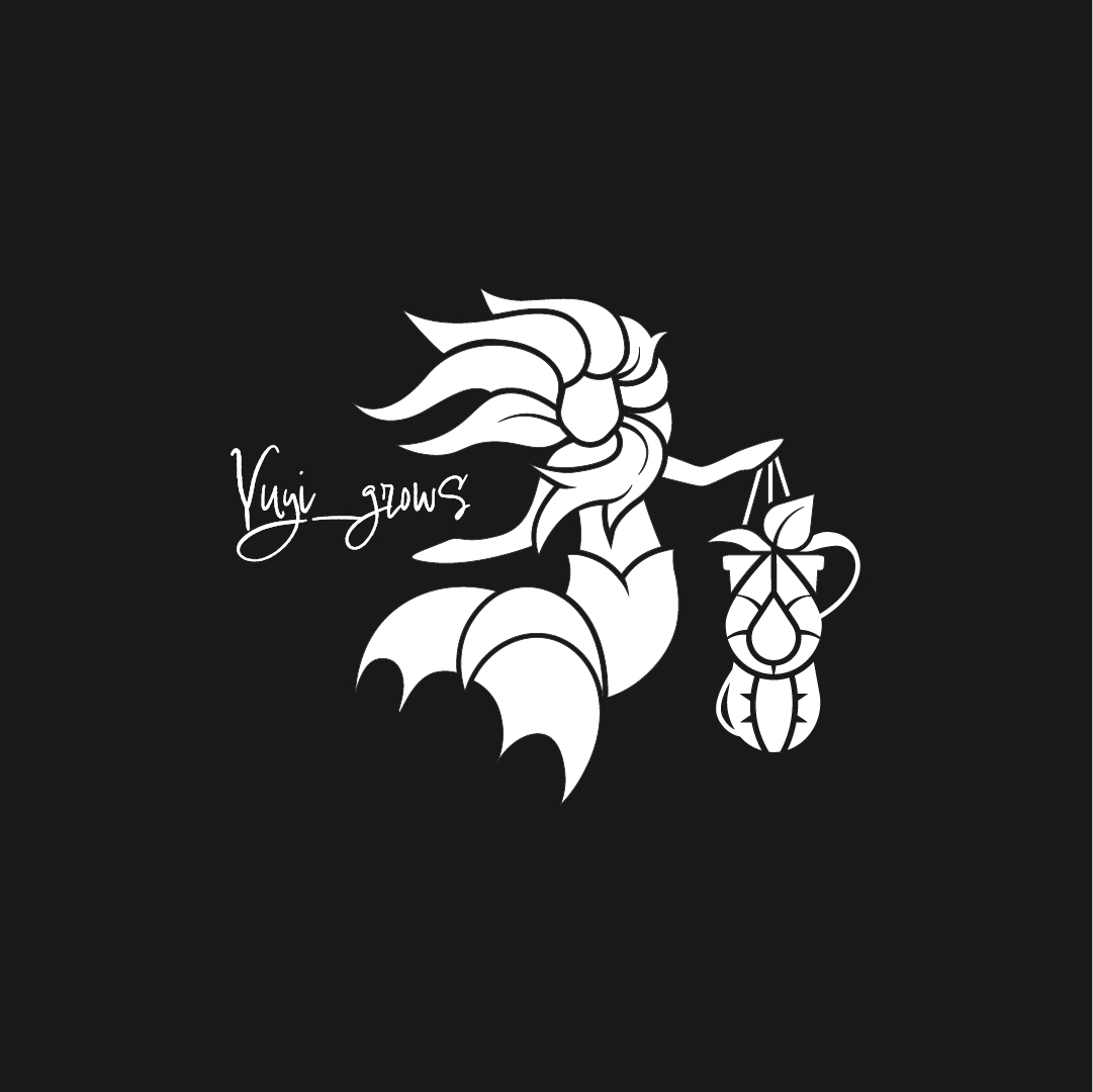
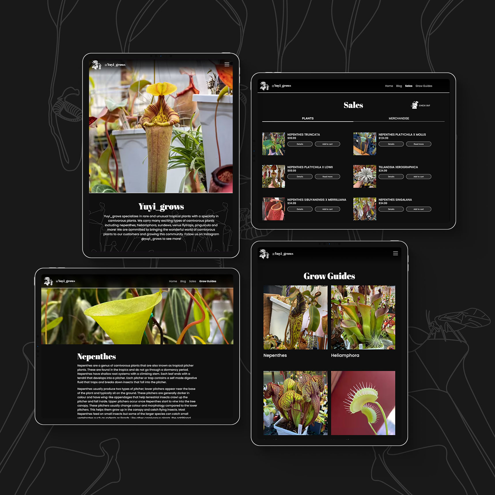
Type Can Make or Break Your Brand
So far we have explored highly-ornate, display fonts. But what about the subtle differences in non-ornate fonts?
Odds are, if your brand’s audience is more business-related than skateboarders, 90’s grunge fans, or gamers, you will be working with less eccentric type treatments to communicate your message to them. This isn’t to say, however, that you can’t still be creative!
You can choose fonts to pair with each other to strike a compelling balance between fun and professionalism. For example, maybe your brand has a script font to add an element of fun and spontaneity to your brand, but it is balanced with an oldstyle or sans serif font that brings a more balanced and readable element to your visual style.
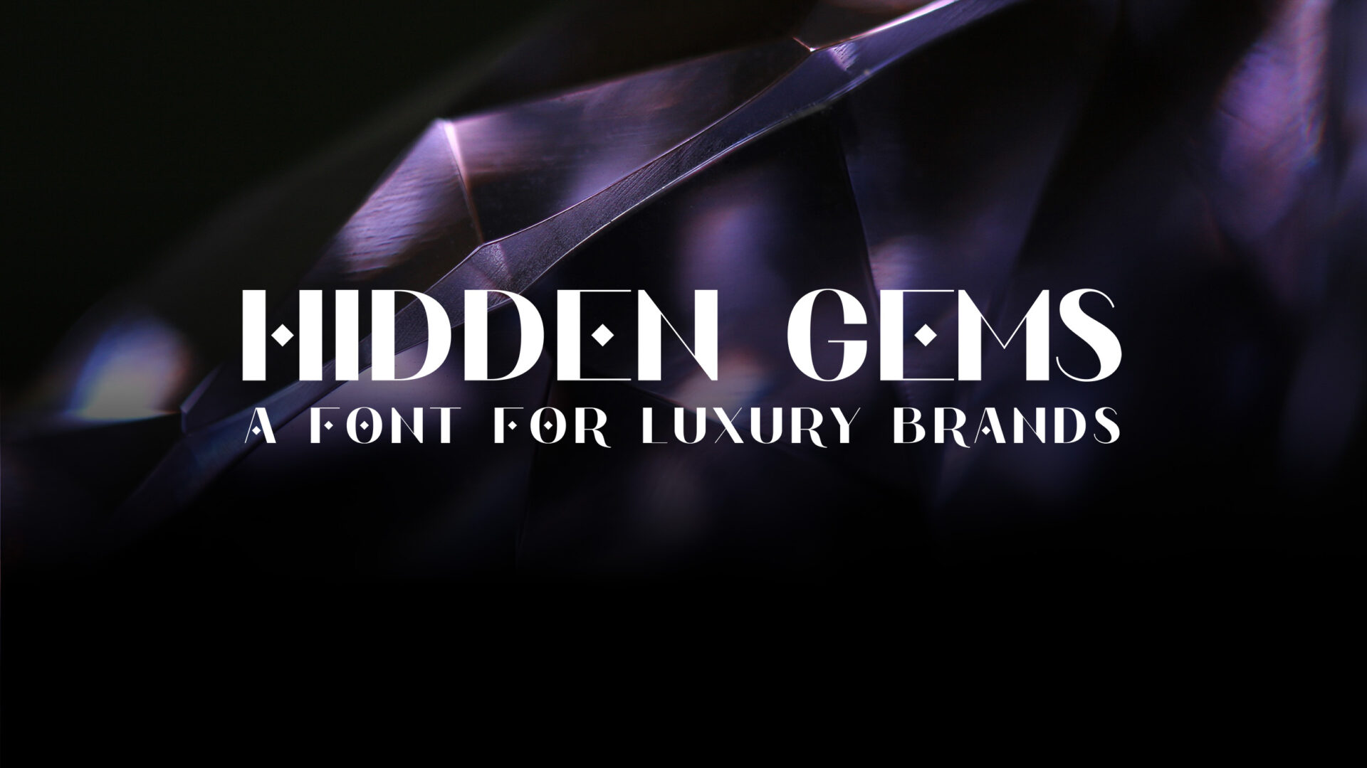
These subtle elements can be seen in the samples below, where we show three examples of the word “Luxury” using type treatments that typically feel luxurious and exclusive. Similar to the more obvious samples above, we draw on these subtle visual elements, the font’s cultural significance through previous application, and visual interaction of each element to make an informed decision of how we want our audience to emotionally receive the message we are sending.

Below is another example of the word “Organic” using several different applications, each referencing different cultural understandings of what it means to be “organic.” The first sample uses organic shapes, resembling cut paper, making it feel like it was crafted by human hands rather than mass-produced by a machine. The second sample has a rustic, imperfect texture, resembling old-style printing press application—again, making it feel less mass-produced. The final sample looks more “manufactured” but has a more bulbous and playful shape to the glyphs which could establish an association with fruit and fresh produce.

Technical Skills
Choosing the right fonts is a great starting point to creating a compelling design, but it doesn’t stop there! It is easy to misuse good fonts and detract from the message you want to convey. Below is a list of important terms and practices to help you create effective, compelling designs using type.

Spacing
Tracking:
The spacing between all letters in a line of text. This should be used sparingly to shorten the lines of text (my rule is no more than -20), but can produce great results when used for spacing out headings and subheadings.
Kerning:
The spacing between individual letters.
Leading:
The vertical spacing between lines of text.

Alignment
Left Align:
Paragraph text aligns left, leaving a ragged right edge.
Center Align:
Paragraph text aligns center, leaving both edges ragged.
Right Align:
Paragraph aligns right, leaving a ragged left edge.
Justify:
Paragraph text spaces itself to create a straight edge on both sides.

Font Classifications:
Sans Serif:
No horizontal strokes attached to the ends of a larger strokes.
Serif:
Horizontal strokes attached to the ends of a larger strokes.
Script:
Simulates cursive writing while generally adhering to mechanical typographic standards.
Slab Serif:
The horizontal strokes ay the end of larger strokes are large, block-like shapes.
Mono:
Unlike other classifications, all glyphs are the same width.
Handwritten:
Simulates handwriting while generally adhering to mechanical typographic standards.

Final Words
These are the reasons that typography matters when designing any type of project spanning from brand identities to websites and everything in between. As you can see, font choices and typorgaphic treatment can determine your tone and credibility, and heavily influence the way readers receive your message. By using these typographic tools and skills, you can create compelling and effective marketing messages that stand out to and connect with your intended audience.

 Reopen Form