
The Riviera is a building designed to accommodate wet lab office spaces and life science research. As one of the first wet lab spaces to be built in Pittsburgh PA, it hosts Life Science Breakfast events, among other seminars to attract collaborators with current tenants and foster an atmosphere of invention and innovation.
With the original branding for the property no longer suiting the new life science ambitions that The Riviera took on, our task was to redirect the brand to match the new bio-tech focus. This led to a re-working of the logotype, refining of the color palette, typographic standards, and helix-style background patterns.
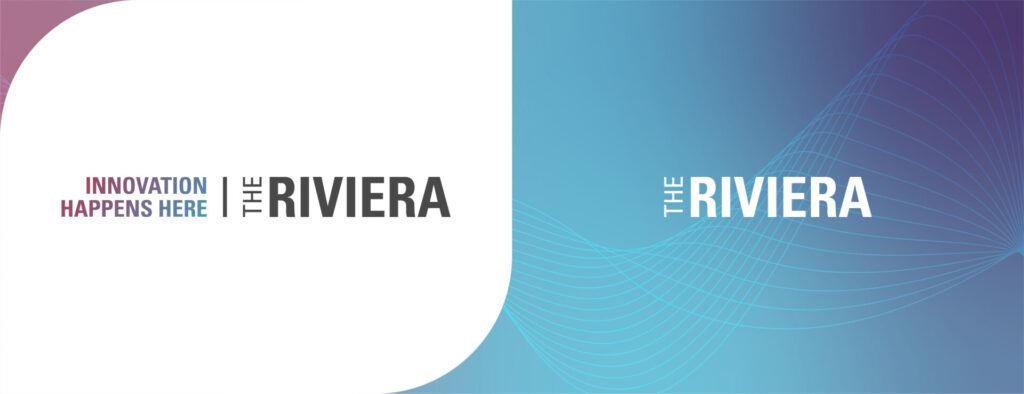
LOGOTYPE
For this brand, we decided to take a strictly typographic approach for its mark. We did this for the purpose of making the aesthetic feel clean and utilitarian to reflect the nature of the building itself. Considering the audience and their mission, we chose to keep marketing language short and to the point and instead highlight the technical capabilities of the space available to them.
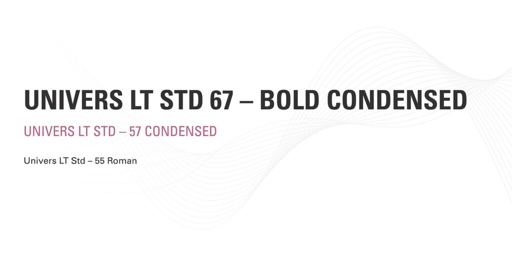
TYPOGRAPHY
The font family used for The Riviera’s brand identity is Univers LT STD. We chose this font because it closely resembled the font used in the original logo, which seemed to still work well in a high-tech/scientific brand. No additional fonts were added as this font family is very extensive with many weights and styles. This also helps maintain the brand’s minimal, uncluttered aesthetic.
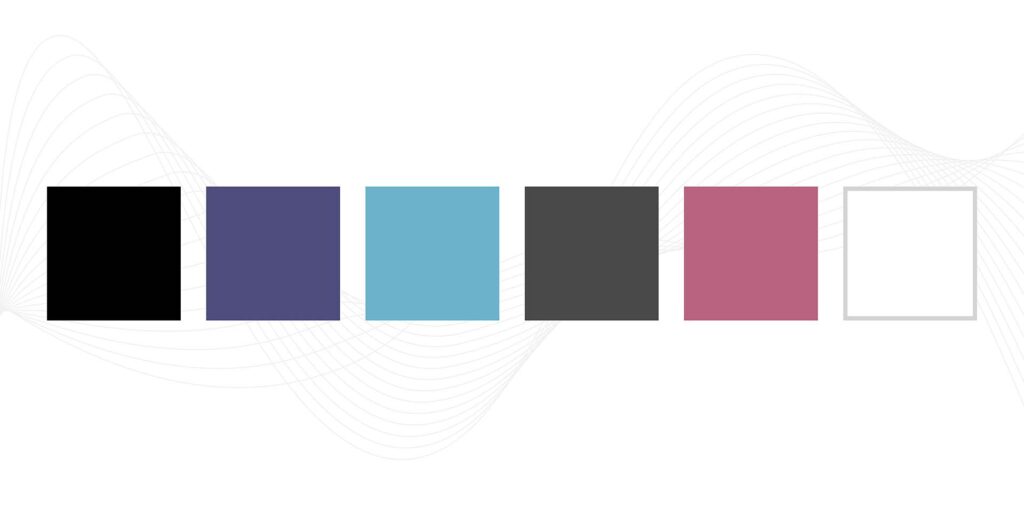
COLOR PALETTE
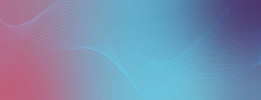
The color palette includes purple, blue, and pink, all colors used in the interior of The Riviera. One of the trademark features of The Riviera is the pink elevator lobby (shown below). Pink was also a key feature of the original brand, although we muted it a bit as to not look as aggressive as it previously had.
PATTERNS
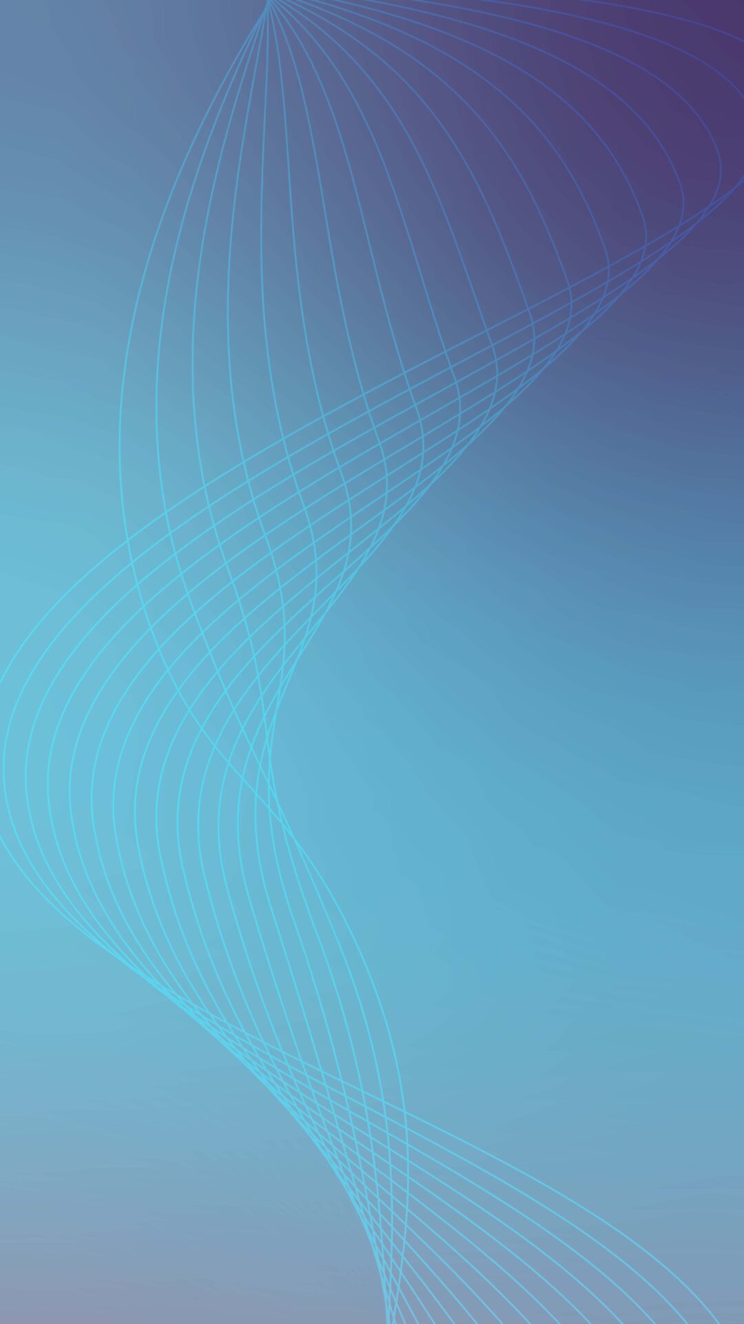
The background helix pattern is the final component of the brand identity, used as an accent piece. The pattern is designed to reflect the biology and technology aspects of the research taking place in the building. The line groupings flow organically and twist like DNA ladders, while at the same time using repetition of elements and color to give it a slightly digital aesthetic.


 Reopen Form