

Introduction and Brief
The Piazza is a luxury shopping plaza under development in South Fayette, Pennsylvania. The property is being developed by Burns Scalo Real Estate, for whom we have done many branding and web projects. Read more about our work with Burns Scalo here. The development of The Piazza was a unique opportunity for them as it was their first retail-centric property. Our role in this project was to create a unique brand identity that would reflect the vision Burns Scalo had for its upcoming shopping plaza, and visually channel this ambition in a way that would be attractive to the people of South Fayette.
We had a lot of creative freedom on this project, as the brief was very open-ended. With room to explore different options, we started filling our mood boards with Italian design and high-fashion clothing ads. Knowing that Piazza is an Italian term, we thought it would be great to include elements of iconic Italian architecture in the final logo.
Explorations
Taking inspiration from high-fashion ads and Italian architecture, we created a bunch of thumbnail sketches, adding, removing, and combining as many components as we could. One image that we referenced throughout the project was a photograph of a water fountain in the Piazza Navona in Rome. The water fountain had beautiful curves contrasting with a few sharp, geometric corners, and in the center stood human figure statues.

Typography
After landing on an icon that we were ready to move forward with, we started looking into typographic treatments. On the typography pairings list were Lust Sans and Medusa (a beautiful script font), Acumin Variable Concept and Rigatoni, Acumin Variable Concept and Retiro STD, and the winning pair, Ogg and Brother 1816. We found Ogg on Typewolf and fell in love with it instantly, and it was also quickly approved by our client.

Color Palette
In the spring of 2021, the president and CEO of Burns Scalo Real Estate was showing a lot of interest in the colors pink and purple. He loved purple as it has historically been associated with royalty and luxuriousness. The reason for this is that the pigments required to make purple inks and dyes used to be very rare. This seemed to be a good opportunity to use some of our art history knowledge and pair it with color psychology, and make the logo purple.

Patterns
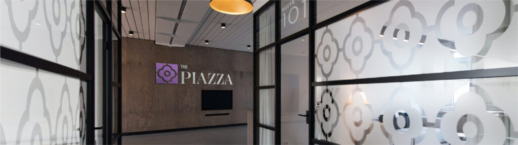
After a few rounds of edits and revisions the logo took its current shape; a flower-like symbol enclosed in a square that was divided into four segments. This logo was designed to be both micro and macro-focused at the same time. In the macro interpretation, the composition is an aerial, top-down view of a plaza with a water fountain in the center. In the micro interpretation it is simply a tile or architectural ornament resembling those found in iconic Italian-style buildings.
The Logo
After a few rounds of edits and revisions the logo took its current shape; a flower-like symbol enclosed in Our research came in handy when creating The Piazza’s patterns. Drawing inspiration from luxury clothing brands such as Gucci and Louis Vuitton, we designed a repeating background pattern utilizing the main logo. The pattern was designed to be used as wallpapers, window vinyls, among other environmental features, which will help create brand recognition with guests shopping at the plaza.
Conclusion
Creating a visual identity for The Piazza was a fun project that allowed us plenty of creative freedom and yielded a final result that we all take pride in. While the brand voice and identity still need to be further developed before the entire branding process is complete, The Piazza now has its logo on high visibility signage in South Fayette to help build brand recognition before construction is complete. We look forward to further developing the brand with Burns Scalo Real Estate in the near future.

 Reopen Form