
INTRODUCTION
In 2021, Rising Creek Bakery joined forces with Tutto Gelato Café to open a new location in Morgantown, WV. Rising Creek Bakery, located in Mount Morris, PA, is known for its homemade salt rising bread among other delicious baked goods. Tutto Gelato Café (Zane’s former place of employment) was a longtime Morgantown favorite. Specializing in homemade gelato, an Italian specialty ice cream, Tutto Gelato eventually out-grew their previous locations and business models, making this pairing with Rising Creek a logical next step.
BRIEF/SCRATCHED LOGO
The three business partners involved in the new business came to the table with a few loose logo ideas that they wanted us to start with. These concepts, however, did not sit well with all of the partners. We tried a few sketches, and eventually a digital version, but none of them felt like a compelling representation of who they were as a business.
With the original concept being scrapped, they gave us a new prompt: be creative and try some different ideas. This is where we rolled up our sleeves and got conceptual. The good news was that not all was lost when we scrapped the original idea. We retained the main font, Serenity, and some of the colors from the original palette.
THREE NEW CONCEPTS
Going back to the drawing board, we combined information from our research, discovery sessions, and from the pre-existing brands from both of the original businesses. From this process we were able to create three new logo mockups that we felt represented the business and their desired aesthetics.

OPTION 1
Option 1 was an abstract representation of the joining of the two businesses and their families. The original Rising Creek Bakery is located on the edge of the woods and next to a creek, so we drew our inspiration from its environment and combined those elements with a few typographic tricks to tell a story. The green arrows double as mountains and/or tree-tops. We see tree-tops, which are strategically placed over the two letter I’s in “Rising” which act as tree trunks. The letter R flourishes out into a creek and connects to the letter K, and “Tutto Gelato” is nested in the banner created by the creek. Lastly, the tree-tops/mountains also act as arrows, pointing up, to signify “rising”. We also added in three trees originally to represent the three partners who started the project, but they wanted to add in a fourth for a spouse who would also be playing a role.
We pushed for them to use this concept as it was packed with thoughtful components and imagery while reWe pushed for them to use this concept as it was packed with thoughtful components and imagery while remaining visually minimal and memorable. The only issue that we ran into with this logo was the scalability, which we were determined to solve with different layouts, but the concept was eliminated for another before we got to that stage.
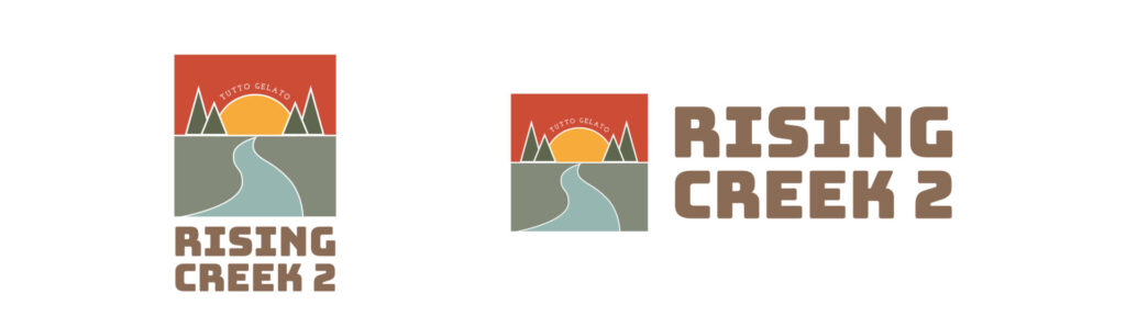
OPTION 2
Option 2 contained a few of the same elements, such as the four trees and the creek, but its layout was more of a modular system containing two components: an icon, and text. It also contained large, blocky type, meant to give the logo a vintage aesthetic as if it were created using an old-fashioned letterpress. This option contained orange and yellow, modified from the original Rising Creek Bakery logo for the sake of brand continuity.
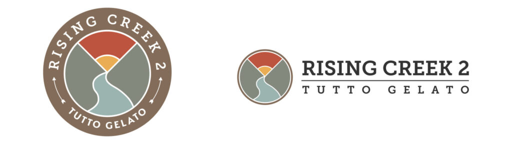
OPTION 3
Option 3 was a seal of a creek flowing between two mountains (representing the two pre-existing businesses) into the sunset on the horizon. We also included arrows as text dividers within the seal, which provided brand continuity from the original Rising Creek Bakery logo which contained an arrow piercing an RC monogram and was also laid out in the form of a seal. This concept utilizes Josefin Slab, a free typeface found on Google Fonts, which we chose for the purpose of allowing the owners of the business to create their own graphics without having to purchase any additional assets.
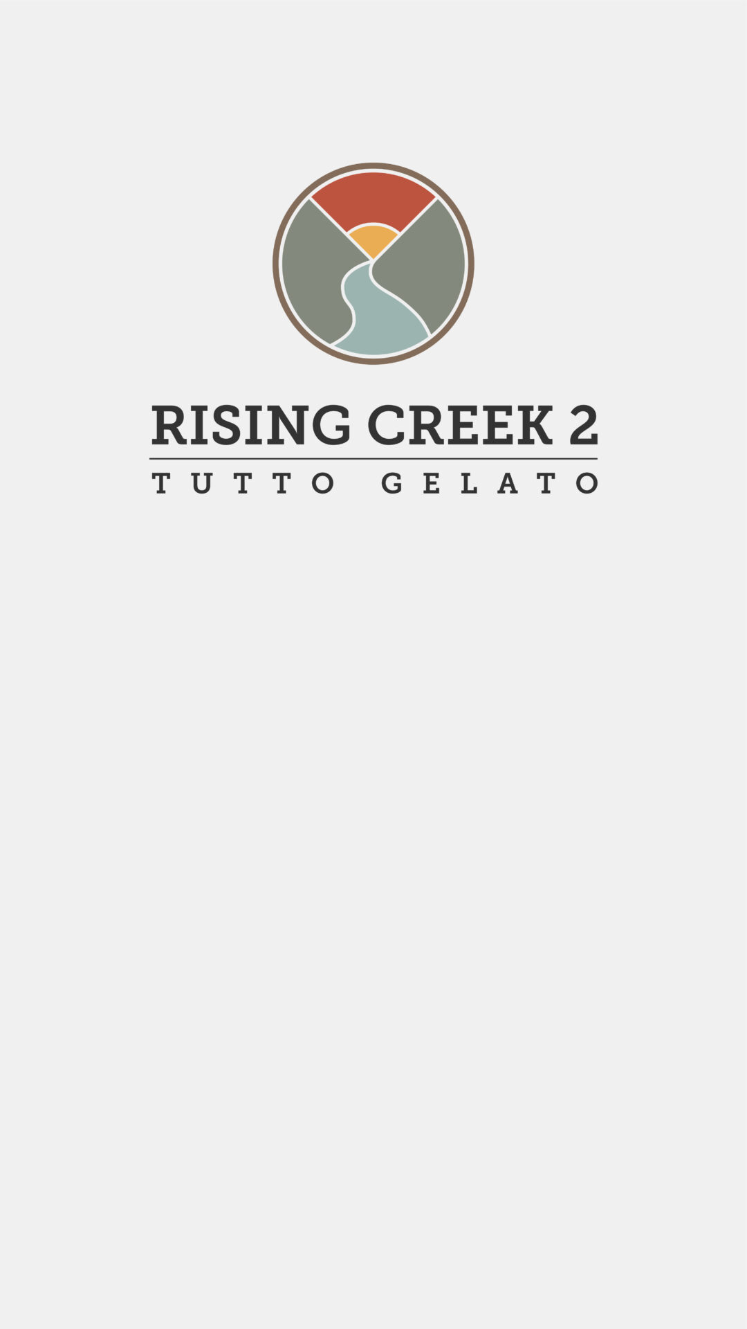
AND THE WINNER IS: OPTION 3
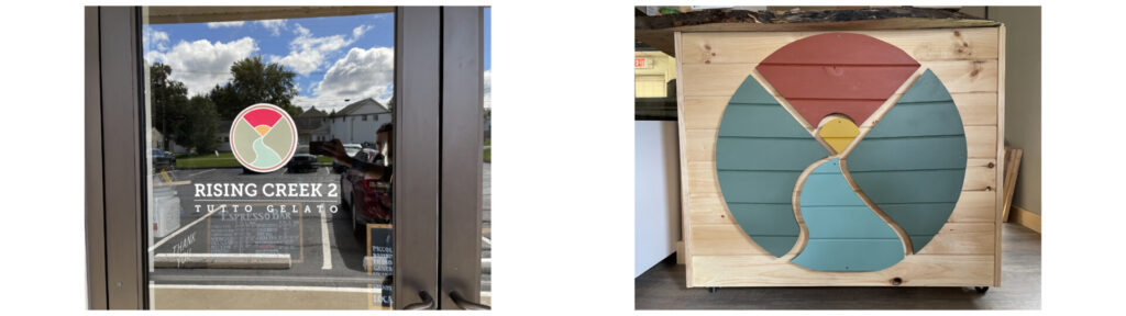
The decision came back pretty quickly that they would use option 3 as their official logo. We started prepping the vector files for production on all of their marketing materials shortly after. The logo was placed on the front door, their street signage, website, and even a succulent sculpture inside the new location. During the official roll-out, we made an animated scene based on the logo that was used on their website (top of this page).

CONCLUSION
Rising Creek 2 – Tutto Gelato enjoys high-level brand recognition around Morgantown, WV. They are a great example of business owners who utilize their brand’s visual identity to increase recognition and even brand loyalty among their customers. They have a unified visual identity and voice across all digital and printed media, and it even extends to the interior decoration of their café.


 Reopen Form