INTRO
In the summer of 2020, roughly four months into the Covid-19 pandemic, we began working with Burns Scalo Real Estate, a commercial real estate, development, and management company based in PIttsburgh, PA. Determined to come out of the pandemic leaps and bounds ahead of their competitors, their new marketing department was exploring the possibility of rebranding the company.
Having been in business for 65 years, Burns Scalo is a well-established company in the Pittsburgh area. They are recognized for their beautifully designed luxury office buildings, built to foster creativity and collaboration. Their brand identity was no longer aligned with the ambitious work that Burns Scalo was taking on.
DECISIONS
We kicked off the rebranding process by making a few decisions regarding how far we should push the changes to the existing brand. They were sure that it was time to revisit their logo; a decision I fully agreed with. But the logo is just one component of the brand. We had to ask ourselves a few questions: Do we change the color palette? Do we change the typography? How do we expect the employees to respond to the new identity?
Given Burns Scalo’s history, we decided to keep as many of the brand’s elements as possible to retain brand recognition within and outside of the company. We determined that this would also avoid resistance within the company to adopting a new identity, as it is common for organizations to experience a lot of push back when rebranding.
LOGO
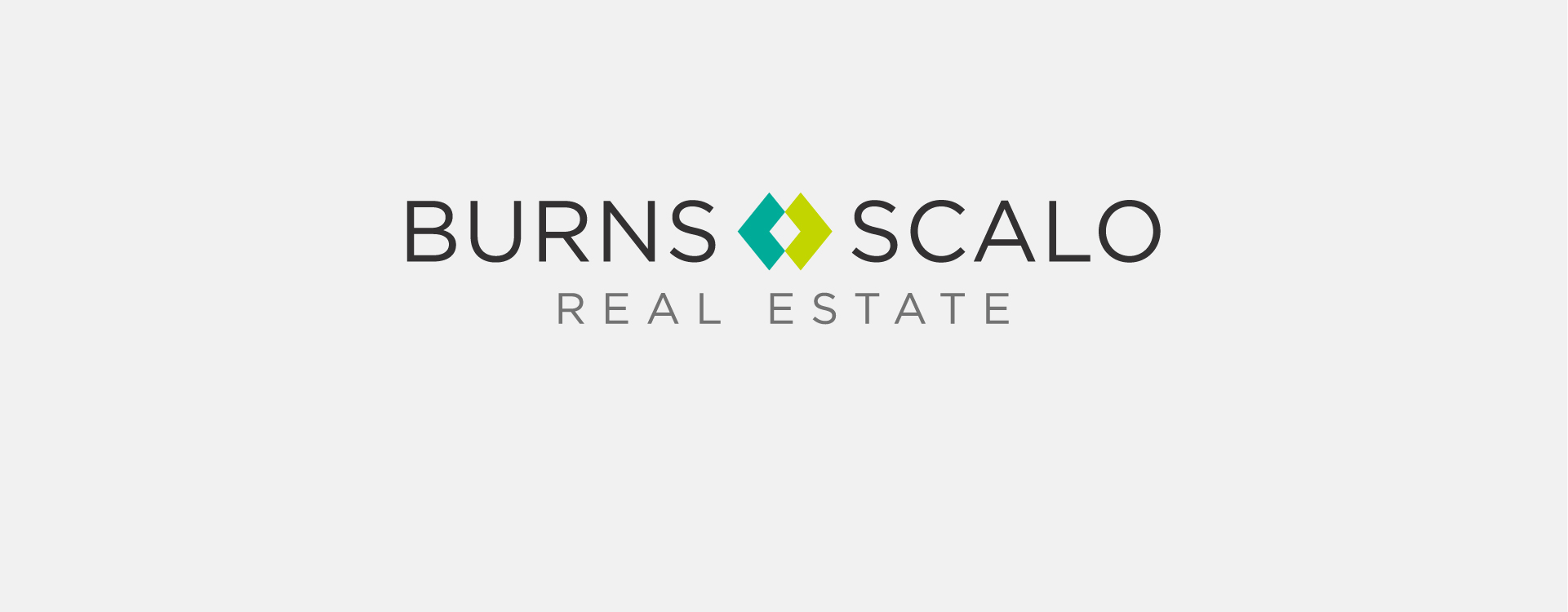
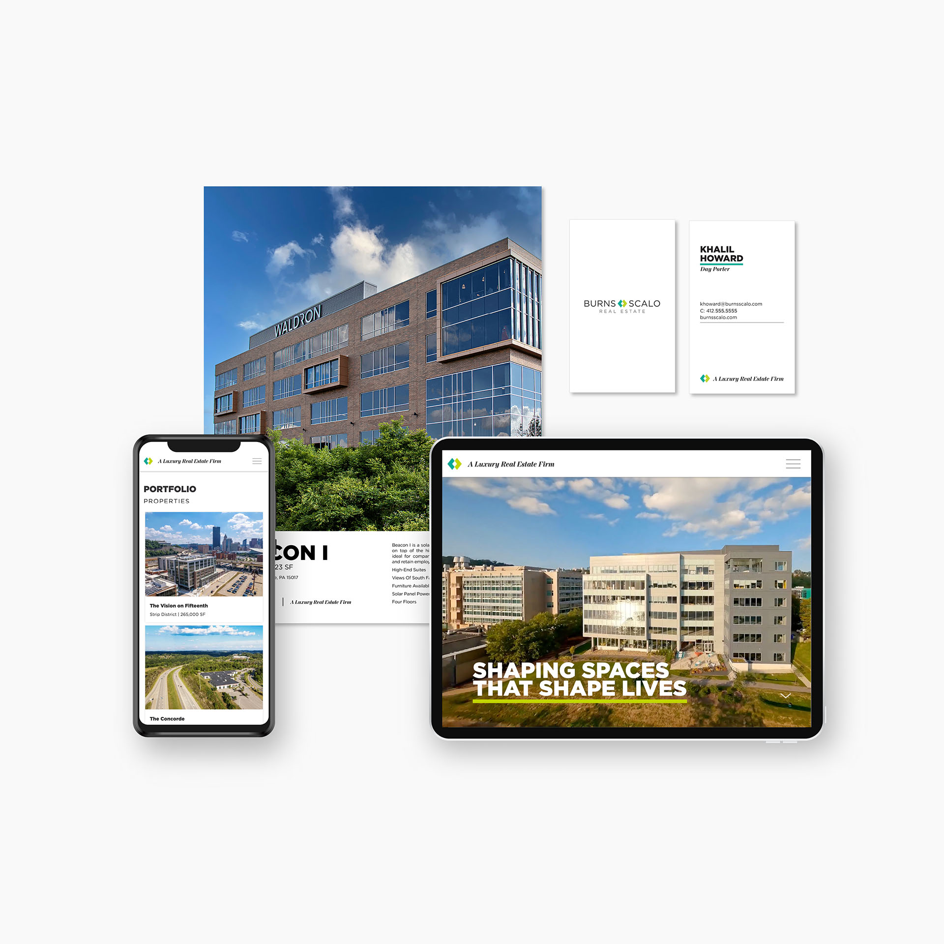
The obvious starting point was to give the logo a refresh. At our time of starting the project, their logo had the name enclosed in a rectangle, which was wrapped in an oval disc-like shape that occasionally contained other information, such as the department name, or the year they were established. It was bulky, neon green, and felt very imbalanced.
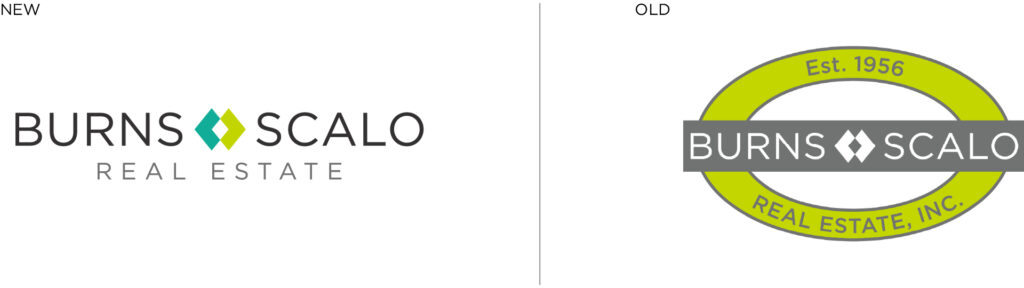
We did our initial mockups, mostly consisting of reductive ideas, to remove any components that were unnecessary. We removed all of the enclosure shapes, leaving just the text and the two diamonds in the center of the name. The words “Real Estate” were added in a second line below the “Burns Scalo” line.
The neon green that once made up most of the logo was now used only in the right diamond. The left diamond was filled turquoise to distinguish each other as two independent shapes that come together to form one shape. It is a meeting point for two elements, representing the partnership of the two original owners of the company.

COLOR PALETTE
On the topic of color, there was a lot to consider. There was not a consistent color palette across the brand identity. The office, however, had accent walls that were the same green as the logo, turquoise, and orange. We had to consider whether to use these colors that were not typically perceived as being luxurious, but familiar with the company’s workers, or change the colors, consequently making them repaint the office and potentially even their carpet.
For the purpose of not being wasteful, we used the colors on the walls and carpet in the office. We decided that it would be best to use these colors as accents, and not apply them too liberally. This would balance the need for familiarity with the desire to be perceived as a luxury real estate firm.
TYPOGRAPHY
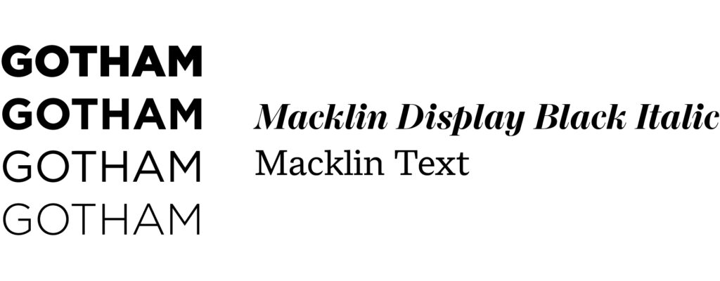
The original brand used Gotham as its primary typeface. We decided to keep Gotham, as it aligned with the new direction we were taking with the rebranding. As a Hoefler & Co. font, it is well respected in the design community, and common among many trusted businesses, and even political campaigns.
With the original brand having no secondary typeface, creating a great font pairing was no small task. After much research and exploration, we landed on a beautiful variable font family called Macklin. It had many styles within the family, including Display, Text, Slab, and Sans Serif. We only used Display and Text styles, as a Slab Serif font did not suit the new aesthetic, and the Sans Serif style was unnecessary because we wanted to keep Gotham as the primary font.
Gotham is used for the headings and body copy on web and screen, and Macklin is used for body copy on print pieces. Macklin Display Black Italic is used as a subheading in most cases, and it also stands alone for the tagline.
A LUXURY REAL ESTATE FIRM
Speaking of taglines, Burns Scalo adopted a new one towards the end of the rebranding process: “A Luxury Real Estate Firm.” The idea came from the president and CEO of the company, when he requested a design with that text to be applied to a steel beam for a ceremony at a new development. The design we returned to him was so well-liked that it was adopted as a tagline/logo bug and is now widely used across marketing materials.
RESULTS
Great aesthetics are one thing, but performance and results are how we measure the success of a branding project. Since rebranding, Burns Scalo Real Estate has gone on to win Pittsburgh Business Time’s #1 Best Place to Work, and the Pittsburgh Chapter of NAIOP’s Developer of the Year. They have also enjoyed a heavy increase in traffic to their new website (also designed and developed by our studio). *Website case study coming soon.
CONCLUSION
Rebranding Burns Scalo Real Estate was a major project that took place over the course of a year. Taking into consideration their workers’ relationships to the original brand, their legacy, and where they were trying to go, we worked with them to develop a strong brand identity with minimal internal resistance. We still hold a contract with them two years later, having designed and developed their new website, creating brand campaigns, and even taking on smaller branding projects for individual properties that they have developed.

 Reopen Form